A Brave rebrand

Developing a fresh new outlook for an ambitious and forward thinking club.
Brand / Strategy / Guidelines / Identity / Typography / Design / Motion / Film / Digital / Art Direction / Social
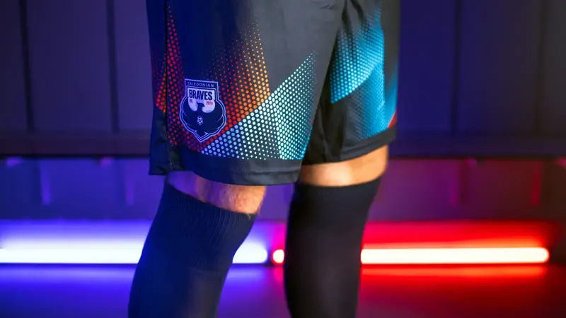
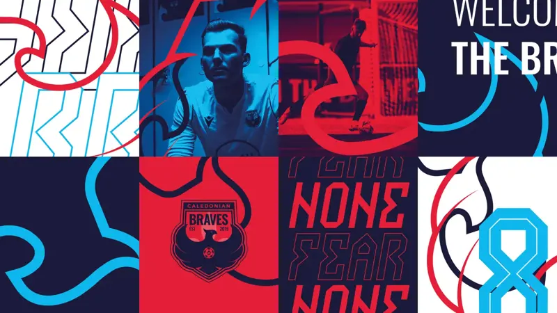
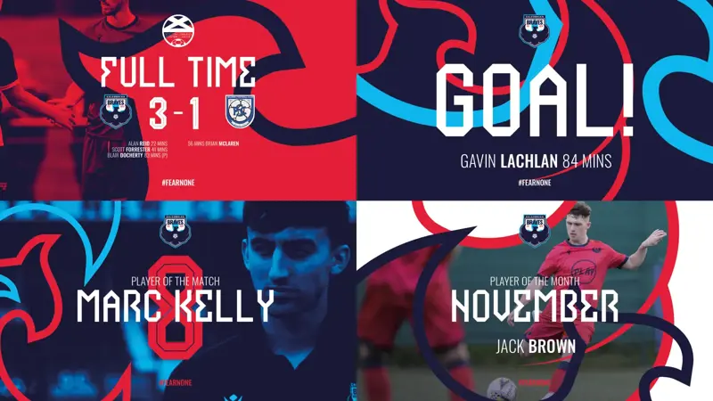
It’s the most exciting time in the history of Caledonian Braves Football Club. Success on the pitch has been matched with innovation off it, changing the face of fan engagement and how a modern football club operates. At the dawn of a new era, it was time to evolve the club’s brand and align it with their ambitious mindset.
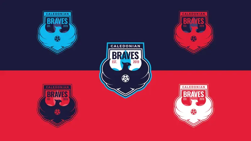
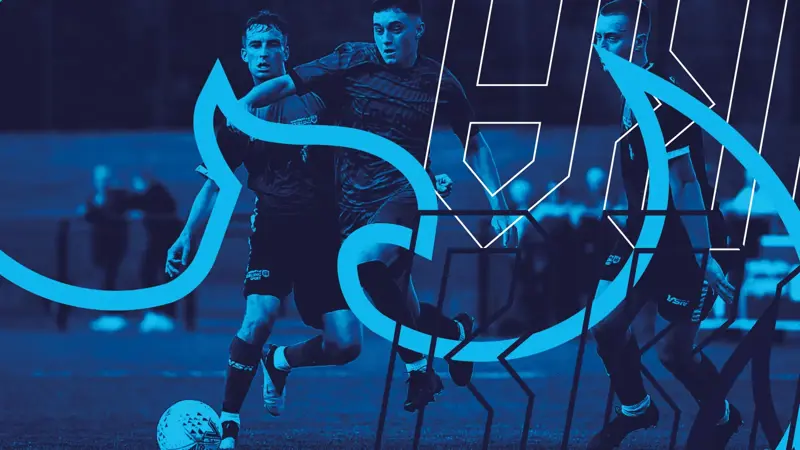
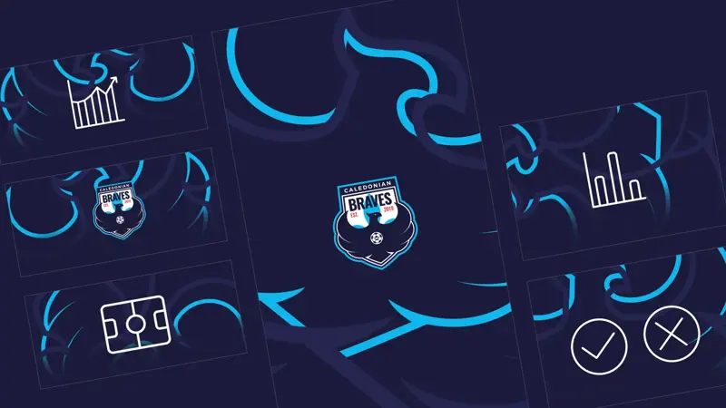
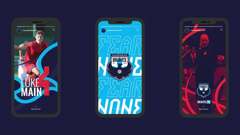
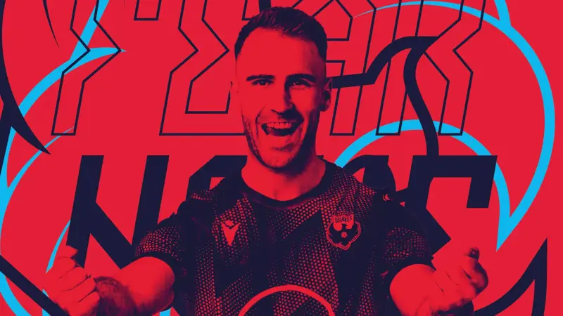
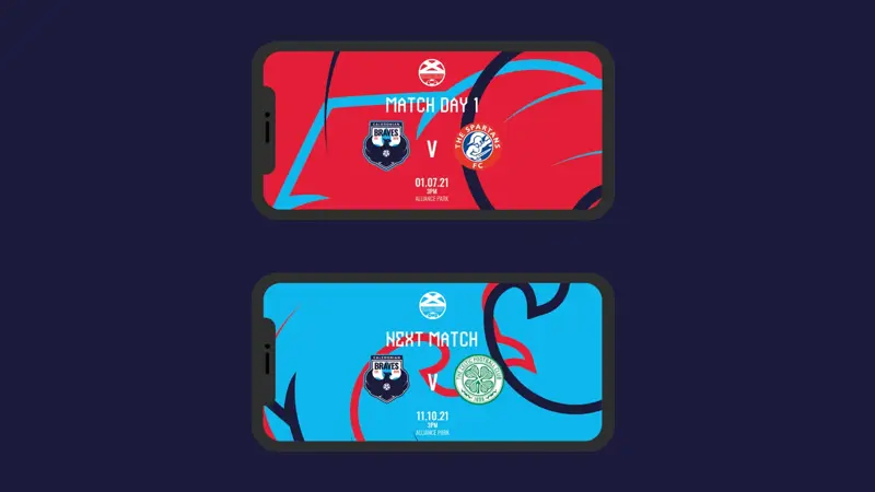
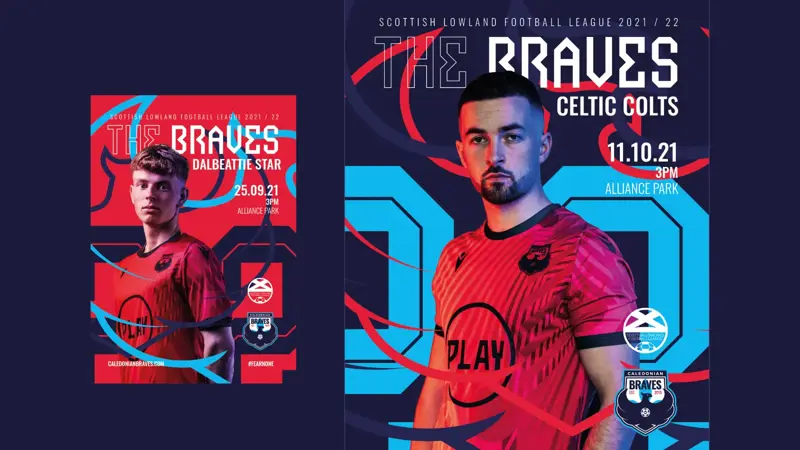
The club’s approach to fan engagement is like nothing seen before in Scottish football and I had develop an identity system that reflected this. Across the whole business, the culture is to innovate and maximise everything they do, in order to gain an edge on the competition. So we put this mantra at the centre of the brand.
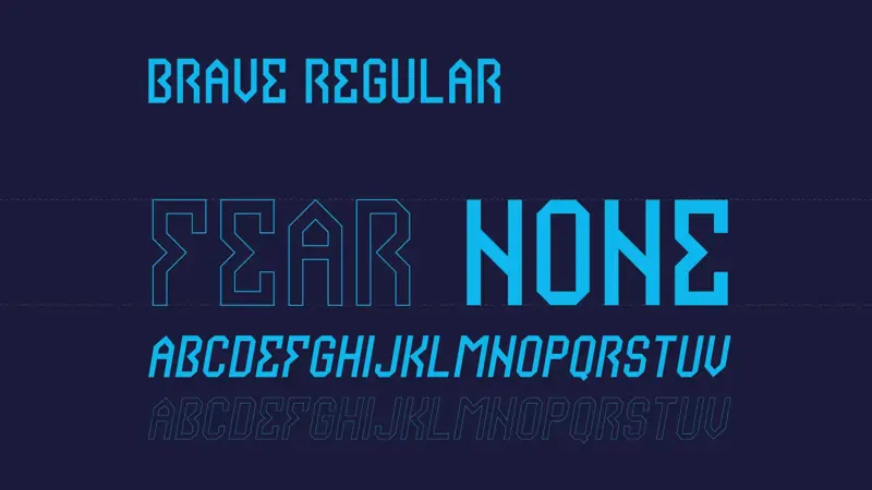
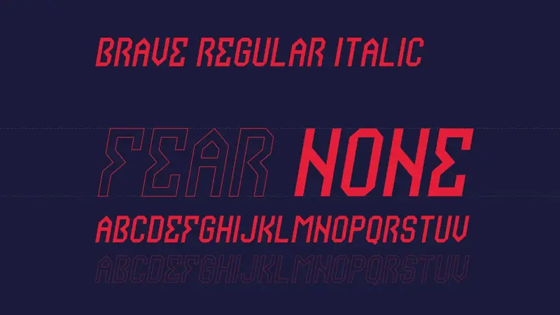
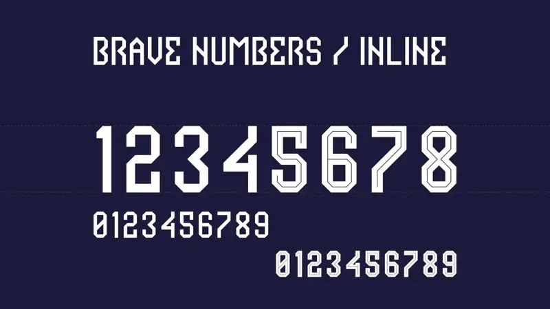
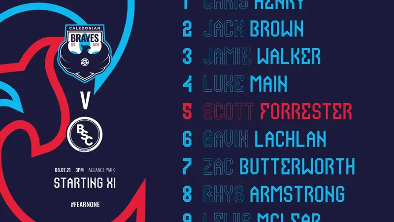
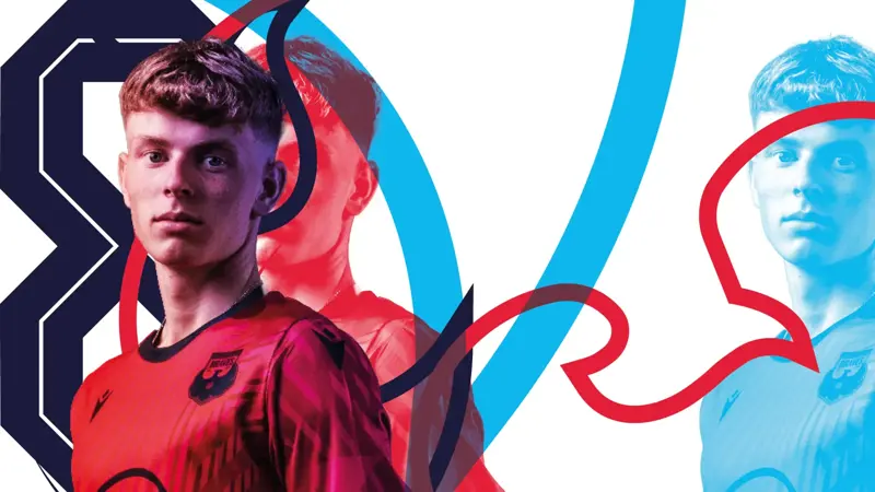
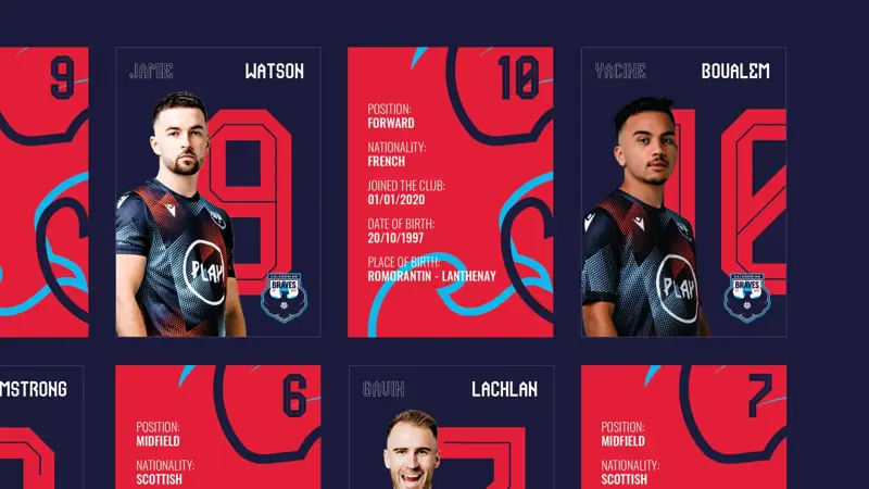
As part of the brand architecture I also developed a bespoke typeface to accompany the creative. The typeface is used across all creative assets and an inline development of the typeface is used on the shirts for numbering.

Next project _ Copa90
