Craft & Harbour

Cooking up a brand identity for a seaside classic.
Brand / Strategy / Identity / Guidelines / Design / Print / Motion / Art Direction / Signage / Packaging
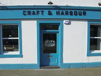
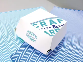
The brief called for a modern, uncluttered, and contemporary brand identity that drew inspiration from the fishing industry, the primary supplier to the restaurant.
My exploration began with delving into the visual language of this industry, uncovering intriguing typography and graphics often featured on the machinery and emblems of fishing vessels.
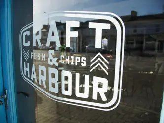
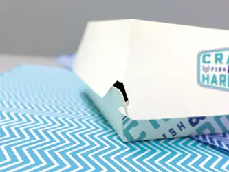
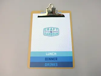
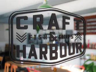
These discoveries served as the foundation for my creation process. I used these findings to craft a customised font treatment for the brand, meticulously assembled in a style reminiscent of the distinct badging we encountered in our research.

Next project _ Chicas Unidas
