Mascarade Opera Studio

Harmonising tradition, talent and opera with Florence's unique heartbeat.
Brand / Strategy / Identity / Guidelines / Design / Print / Motion / Digital / Art Direction / Social
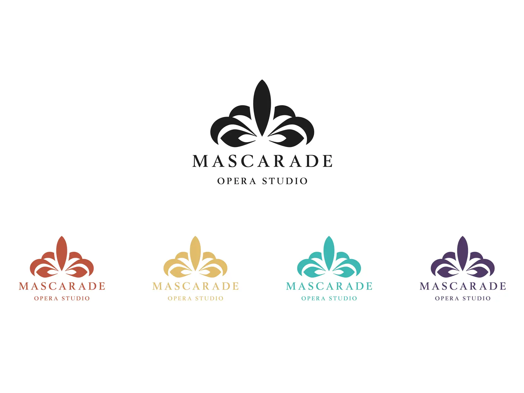
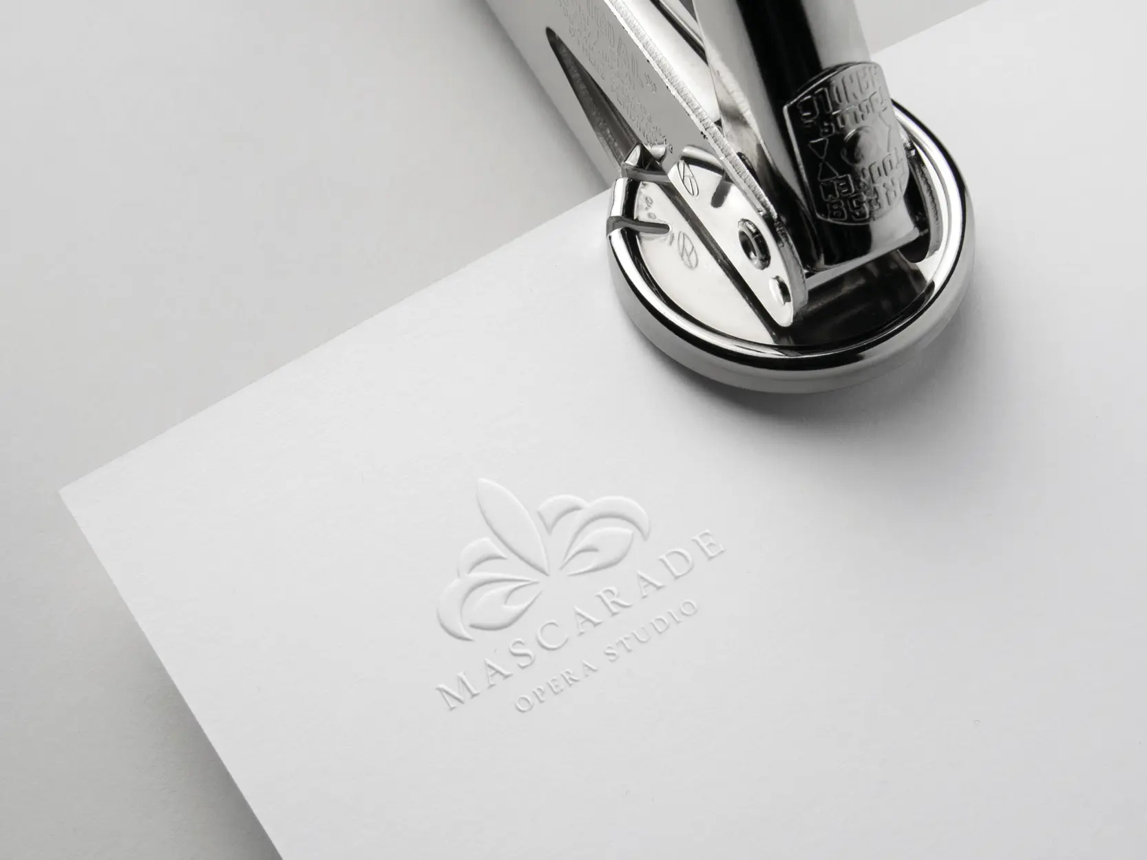
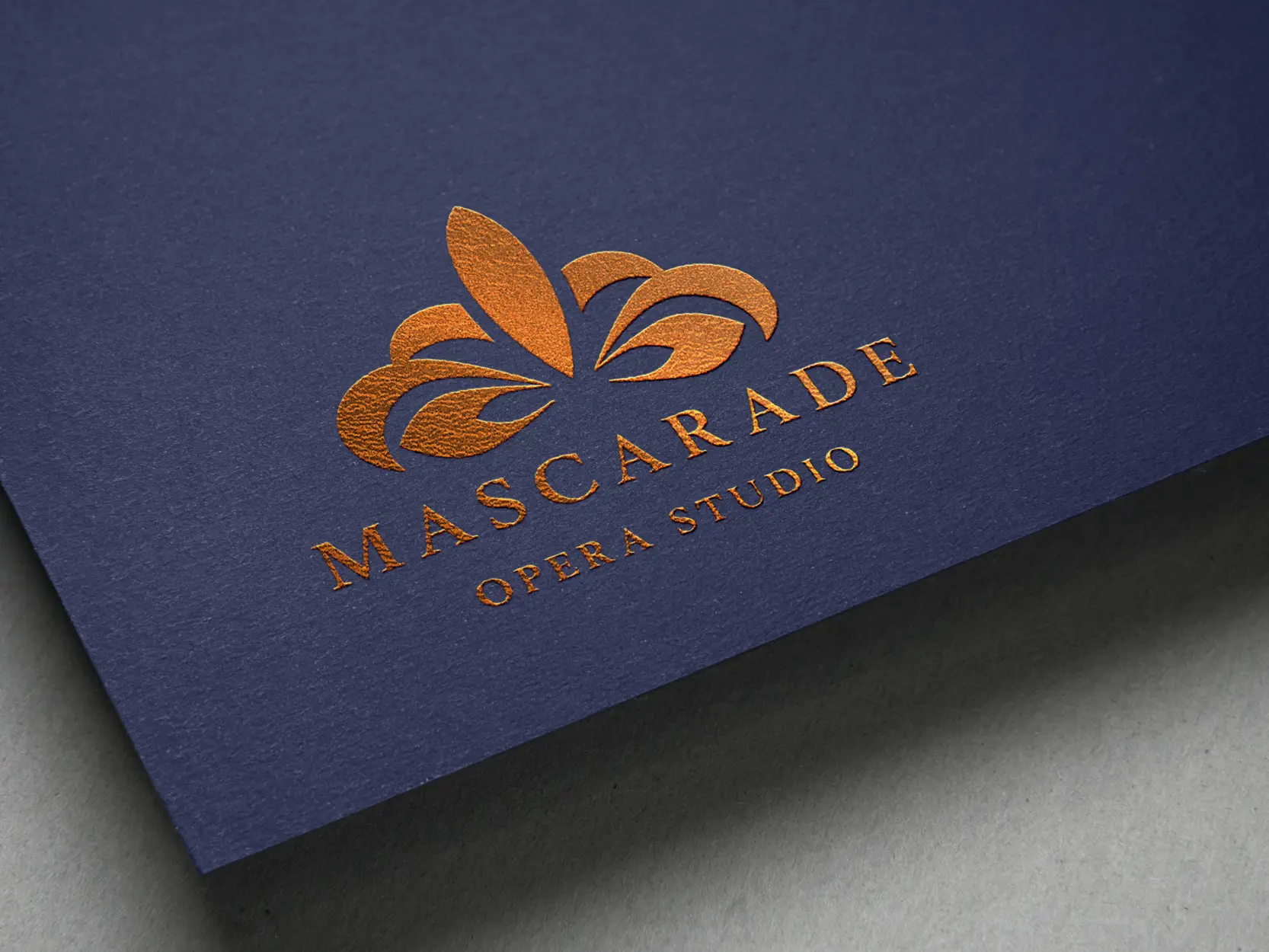
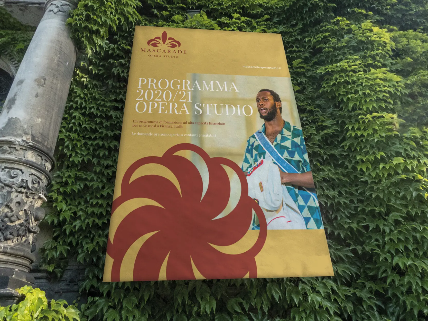
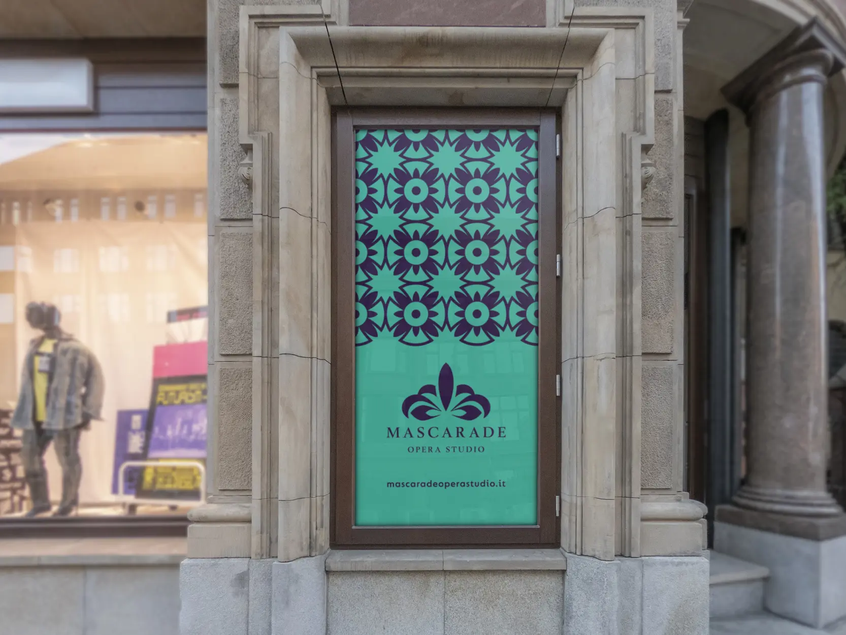
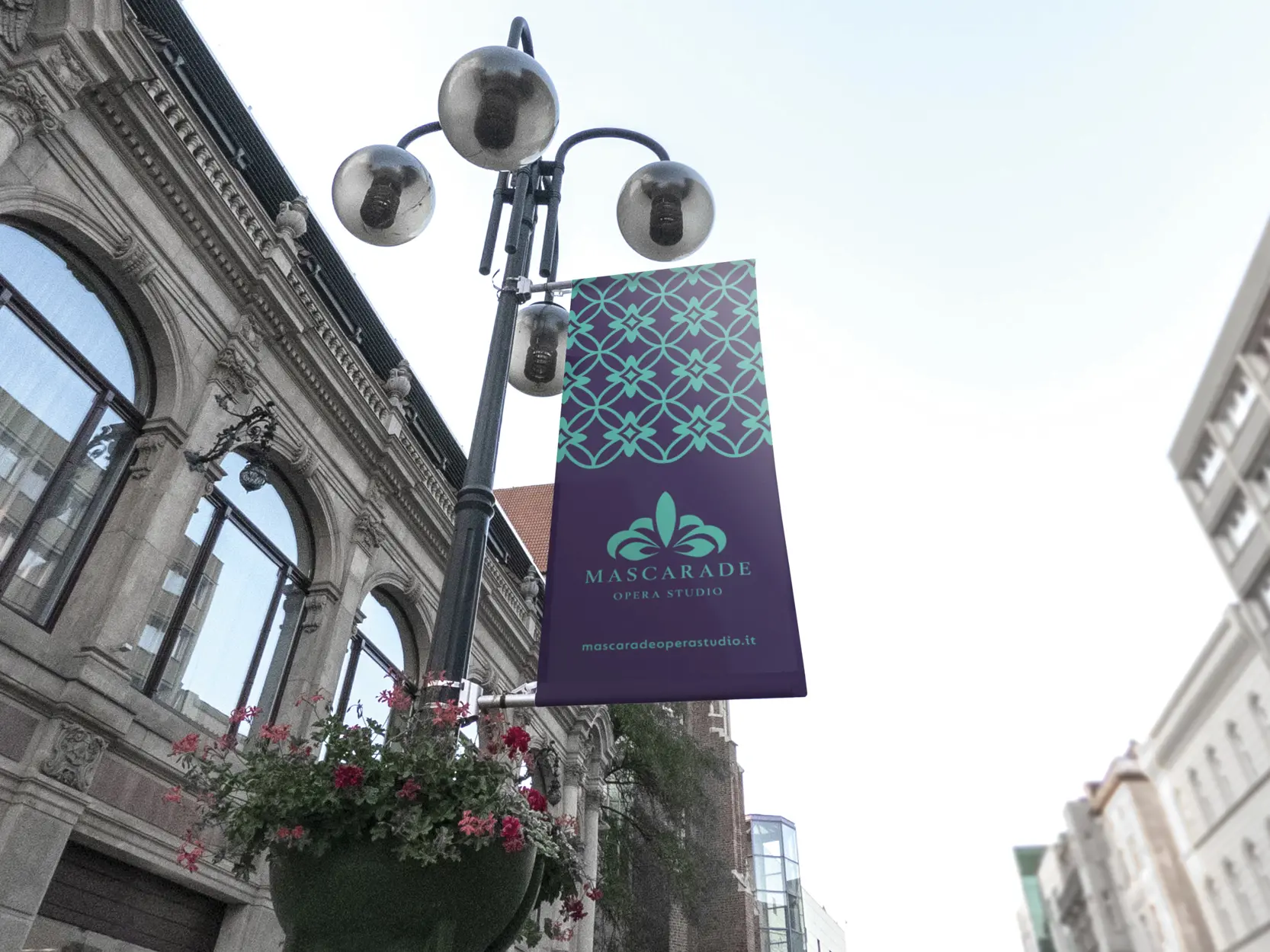
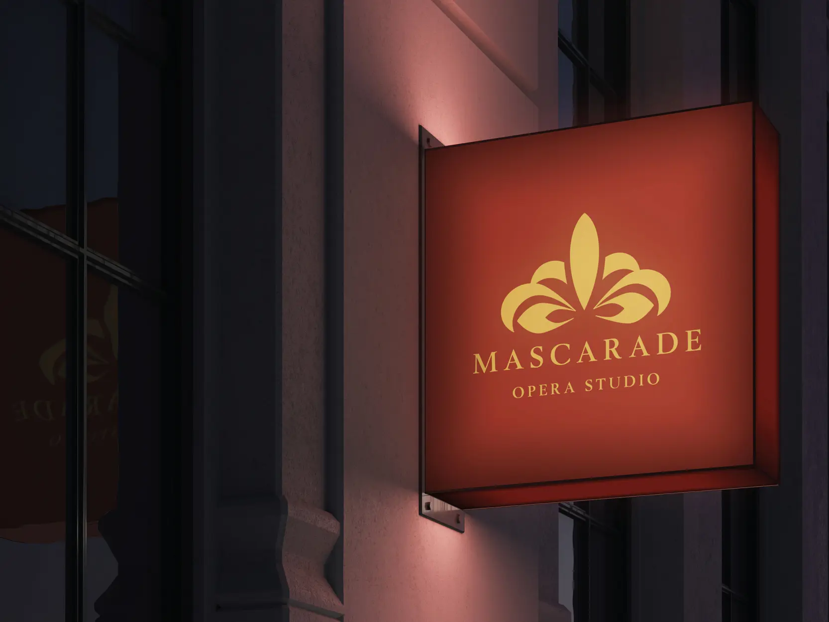
In the bustling heart of Florence, a new opera school has come to life, and I've meticulously crafted a unique brand identity that encapsulates its essence. The design is rooted in the city's cultural heritage, drawing inspiration from the mask, a symbolic representation closely associated with the operatic arts. This emblematic mark incorporates elements of the Fleur de Lis and elegantly weaves the letter 'M' into a tapestry of baroque aesthetics, symbolising the fusion of tradition and innovation.
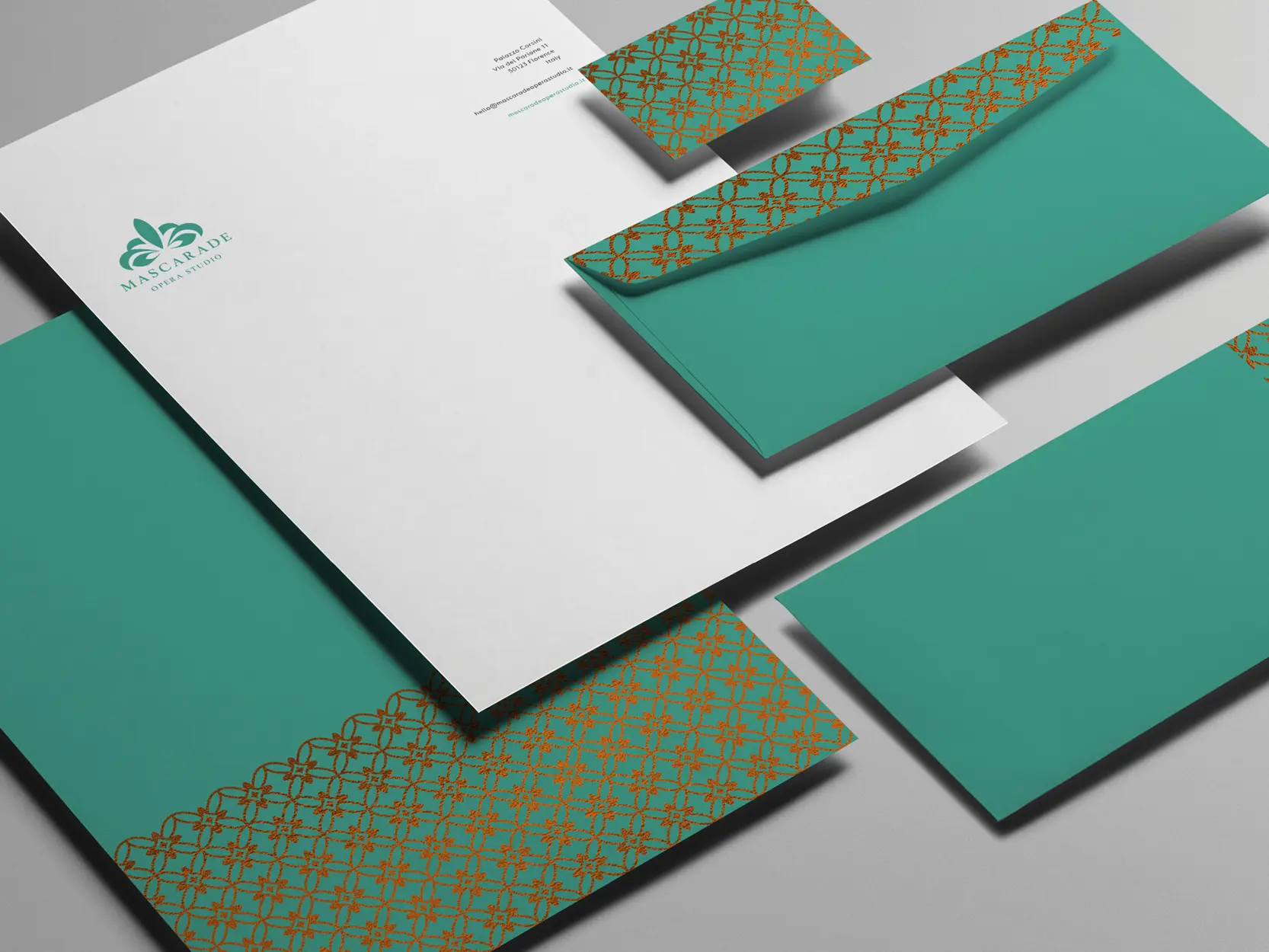
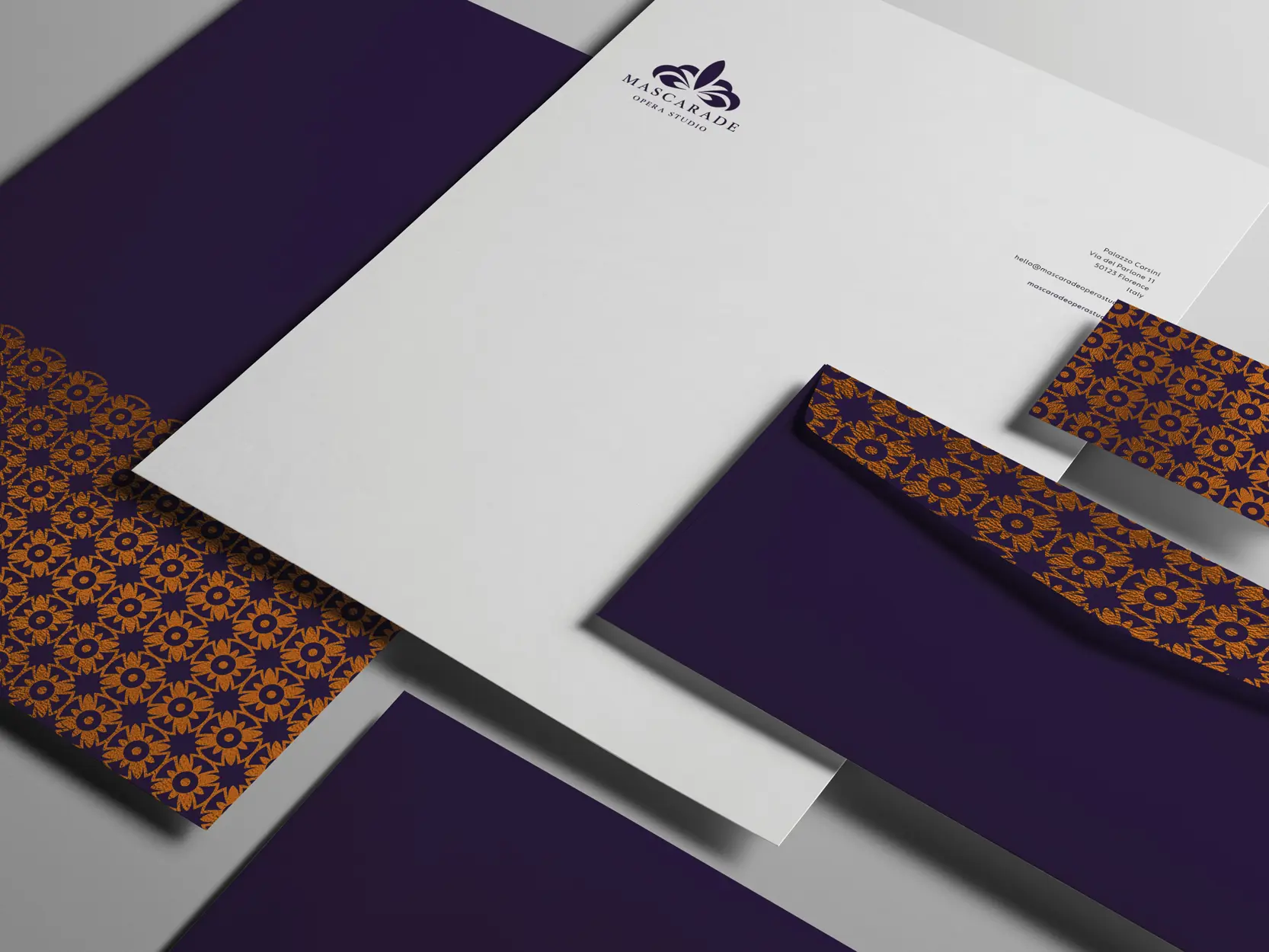
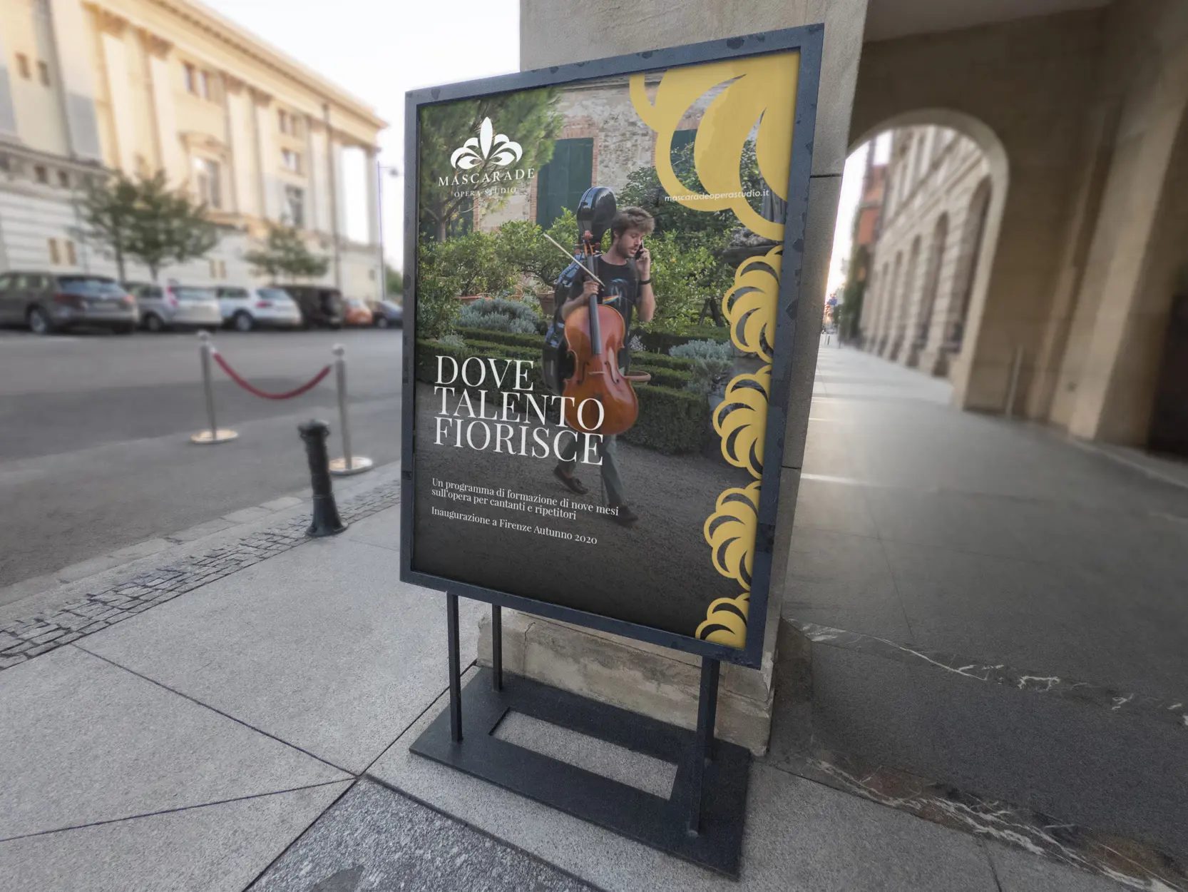
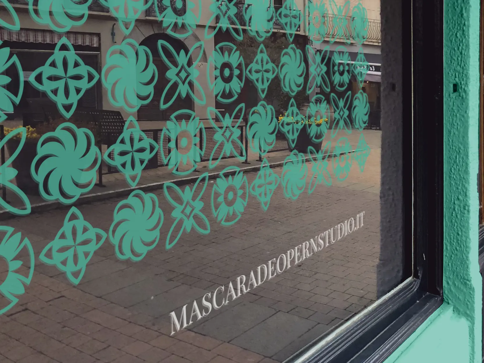
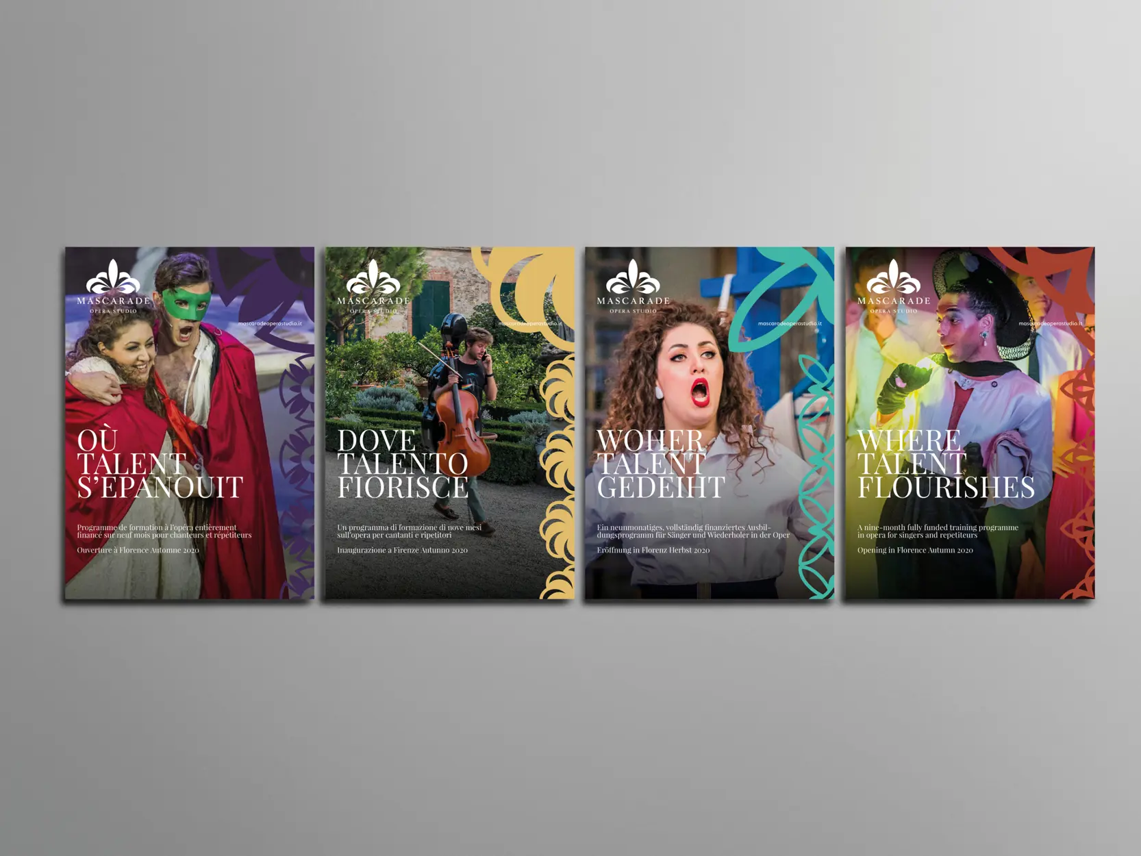
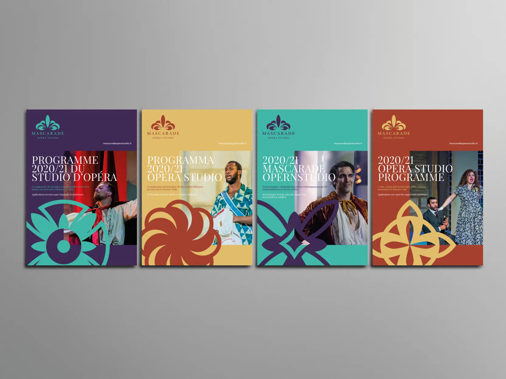
Beyond the emblem itself, the brand identity extends to an array of intricate patterns that pay homage to the ornate beauty synonymous with Florence. These patterns, an extension of the emblem, reflect the city's opulent architectural features. What sets these patterns apart is their significance—each of the four symbols within them represents the historic quarters of Florence. This deliberate inclusion not only adds a touch of splendour but also underlines the school's deep-rooted connection and relevance to the heart of Florence, celebrating its place within the city's rich history.









Next project _ F.C. United
